HOW COLOUR IS USED IN CINEMA
By Bill Bohlen
The
Effect of Colour in Movies (and Videos)
Just as vision and
sound affect us emotionally, so does colour. That’s why movie makers and
videographers use colours to create the atmosphere they desire. We too can do
that.
Color can affect us
psychologically and physically, often without us being aware, and can be used
as a strong device within a story. Knowledge gives you control, and control
means you can manipulate and use color to give your work a powerful and beautiful
edge.
Being able to use color to
create harmony, or tension within a scene, or to bring attention to a key
visual theme can be used to spectacular effect.
In the sense of the work of the world’s greatest
cinematographers we admire so much nothing is accidental. A strong red color
has been shown to raise blood pressure, while a blue color has a calming
effect. Some colors are distinctly associated with a particular location or
place, while others give a sense of time or period.The
The Colour Wheel
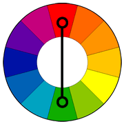
People engaged in using colour in their jobs, including film makers, often employ a colour wheel in their work. The wheel comprises 12 colours based on the primary colours, red, yellow and blue and a combination of mixes of these.
Pairing of two colours is mainly used to come up with complimentary colour schemes which can be used in films and videos/
Two colors on opposite sides of the color wheel make a complimentary pair. This is by far the most commonly used pairing. A common example is orange and blue, or teal. This pairs a warm color with a cool color and produces a high contrast and vibrant result. Saturation must be managed but a complimentary pair are often quite naturally pleasing to the eye.
Orange and blue colors can often be associated with conflict in action, internally or externally. Often a internal conflict within a character can be reflected in the color choice in his or her external environment.
The color palette of Jean-Pierre Jeunet’s “Amelie” is a great example of a complementary pairing of red and green.


